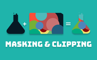
Masking
The CSS mask-image and SVG <mask> is to create a masking layer to control the transparency of an element. The transparency is determined by either alpha or luminance, depending on the masking mode/type.
1. Masking with CSS Gradient : mask-image
| CSS property: | mask-image |
| Value: | linear-gradient(), url(), image(); |
Example:
<style>
.example1{
  -webkit-mask-image: linear-gradient(black, transparent);
  mask-image: linear-gradient(black, transparent);
}
</style>

<div class="example1">
  <img src="img-cssmasking.png" alt="example 1 - masking with gradient" width="333" height="208">
</div>
Mask Layer: Gradient
linear-gradient(black, transparent);
Image
img-cssmasking.png

Result:

In this example, by default, mask-mode: alpha;*
- If the layer mask is transparent, the masked element underneath will be hidden (transparent).
- If the layer mask is colored and has an opacity of 100%, the masked element underneath will be fully visible (opaque).
- The transparency of the masked element will adjust accordingly based on the alpha of the layer mask
**The mask-mode is a CSS property to define whether the transparency of the mask-image is determined based on luminance or alpha.
2. Masking with CSS image : mask-image
| CSS property: | mask-image |
| Value: | linear-gradient(), url(), image(); |
Example:
<style>

.example2{
  width: 333px;
  height: 208px;

  background-image: url(https://uipencil.com/wp-content/uploads/2022/09/img-cssmasking.png);
  background-repeat: no-repeat;
  background-position: center;

  -webkit-mask-image: url(https://uipencil.com/wp-content/uploads/2022/09/img-cssmasking_png-2.png);
  mask-image:url(https://uipencil.com/wp-content/uploads/2022/09/img-cssmasking_png-2.png);
  -webkit-mask-repeat: no-repeat;
  mask-repeat: no-repeat;
}

.example2_bg{
  width:100%;
  background: pink;
}
</style>

<div class="example2_bg">
  <div class="example2"></div>
</div>

(img-cssmasking.png)

Result:

3. Masking with SVG : <mask>
| SVG Element: | <mask> |
Example:
<svg width="138" height="40" >
 <mask id="example3">
   <rect x="36" width="102" height="40" fill="#ffffff"/>
   <path d="M0 19.5L30.75 1.74652V37.2536L0 19.5Z" fill="#ffffff"/>
 </mask>
 <image xmlns:xlink="http://www.w3.org/1999/xlink" xlink:href="https://uipencil.com/wp-content/uploads/2022/09/img-cssmasking.png" mask="url(#example3)"></image>
</svg>

(img-cssmasking.png)

Result:

In this example, by default, mask-type: luminance;**
- If the layer mask is painted in pure black (RGB(0,0,0) or #000), the masked element underneath will be hidden (transparent).
- If the layer mask is painted in pure white (RGB(255,255,255) or #fff), the masked element underneath will be fully visible (opaque).
- If the layer mask is painted in any color between pure black and pure white, the transparency of the masked element will adjust accordingly.
**The mask-type is a CSS property to define whether the transparency of the SVG <mask> is determined based on luminancealpha
CSS Clipping : clip-path
The clip-path is a CSS property to create a vector clipping region that selects which part of an element should be showing. The area outside the clipping region will be hidden.
| CSS property: | clip-path |
Example:
<style>
.container{
  background-image: url(https://uipencil.com/wp-content/uploads/2022/09/img-cssmasking.png);
  background-size: cover;
  background-position: center;
}
.example1{
  width: 100px;
  height: 100px;
  clip-path: circle(50%);
}
.example2{
  width: 100px;
  height: 100px;
  clip-path: polygon(0% 0%, 100% 0%, 100% 85%, 82.5% 85%, 80.83% 99.17%, 70% 85%, 0% 85%);
}
.example3{
  width: 100px;
  height: 100px;
  clip-path: inset(20% 10% 5% 10%);
}
.example4{
  width: 100px;
  height: 100px;
  clip-path: ellipse(30% 40% at 50% 50%);
}
</style>

<div class="container example1"></div>
<div class="container example2"></div>
<div class="container example3"></div>
<div class="container example4"></div>
Result:
Example1 (circle)
Example2 (polygon)
Example3 (inset)
Example (ellipse)
The differences between Clipping vs. Masking
- The main usage of clipping is to control the visibility of the clipped area. The area outside the clipping region will be hidden.
- The main usage of masking is to control the transparency of the masked area.
- Clipping is often used to create basic shapes, such as circles or triangles
- Masking is often used to create more complex and irregular shapes, such as organic patterns or textured backgrounds.


Leave a comment