responsive
responsive
responsive
-
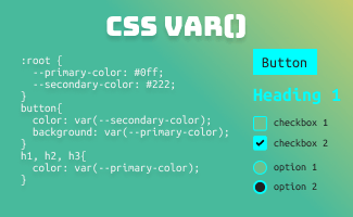
Guide to CSS Variables: Everything You Need to Know
In today’s world, design systems have become fundamental in the modern landscape of web development. A well-established design system not only ensures a professional image…
-

CSS Grid vs Flexbox: Differences & Examples
CSS Grid Layout and Flexbox Layout have different designs and functions, with Flexbox designed for one-dimensional layout and Grid for two-dimensional. In this article, we…
-
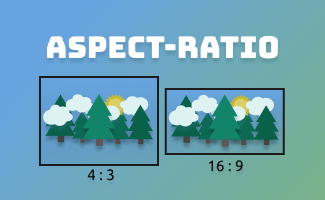
A Complete Guide for CSS aspect-ratio
This article will provide an overview and complete guide for the CSS aspect-ratio, the aspect ratio of an element describes the proportion between its width…
-

A Complete Guide for CSS @container
The @container CSS query provides a solution for the children’s elements to control their’s CSS style response toward the dedicated reference’s container. This feature allows…
-
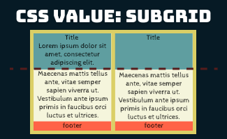
Introducing CSS Subgrid
The CSS Grid Layout Module Level 2 expands on the CSS Grid Layout Module with the introduction of the subgrid feature. The new value “subgrid”…
-

CSS Grid Alignment: Everything You Need to Know
In this article, you will be taken through a detailed explanation and exploration of the topic how does grid alignments works, and how they can…
-

CSS Grid: A Step-by-Step Guide with Examples
The CSS Grid Layout is an effective method of creating a two-dimensional grid-based layout. It is constructed using rows and columns that work together to…
-

CSS Unit Measurement: Your Ultimate Guide with Examples
In the CSS world, plenty of CSS properties like font-size, line-height, width, height, padding, margin, etc are declared in a number followed by a base…
-

CSS Flexbox Tutorial – Unleash the Power of Flexibility
This CSS flexbox tutorial covers everything you need to know to master responsive and dynamic layouts. Learn basic concepts, advanced techniques, and best practices with…
Search
Topics
 ui pencil