
This article is a complete guide regarding how to perform a basic validation for form fields (for eg: <input> box) from CSS. By utilizing :in-range, :out-of-range, :valid, :invalid, :required, CSS is able to perform a first-level validation and customize the appearance based on the validity result.
:in-range & :out-of-range
:in-range is a CSS pseudo-class to select the <input> element when the value of the <input> element is within the range.
In opposition, :out-of-range is to select the <input> element when the value of the <input> element is out of the range.
| CSS pseudo-classes: | :out-of-range |
HTML & CSS:
<style>
  input:in-range{
     border: 2px solid green;
     background: lightgreen;
  }
  input:out-of-range{
     border: 2px solid red;
     background: lightpink;
  }
</style>
<input type="number" min="0" max="10" />
To specify the range, a min and a max attributes are required.
Result:
In this example,
- If the input value falls within the range (0-10), the input box will be applied to a light green background and frame with a 2px green border.
- If the input value falls out of the range, the input box will be applied to a light pink background and frame with a 2px red border.
Note: When the input box is empty, the <input> value will count as “in-range”
Check out the actual effect:
https://uipencil1.s3.ap-southeast-1.amazonaws.com/post/uipencil-how-to-check-form-validity-from-pure-css.html 
:valid & :invalid
:valid is a CSS pseudo-class to select the <input>value is fulfilled all the requirements/when the contents validate successfully.
In opposition, : is a CSS pseudo-class to select the invalid<input>value not meeting the requirements/when the validation of the contents failed.
| CSS pseudo-classes: | :invalid |
CSS:
<style>
  input:valid{
      border: 2px solid green;
      background: lightblue;
  }
  input:invalid{
      border: 2px solid red;
      background: lightgoldenrodyellow;
  }
  input:valid + label::after {
      content: "the value is valid";
      color: green;
  }
  input:invalid + label::after {
      content: "the value is invalid";
      color: red;
  }
</style>
HTML:
<label>
  <strong>Example 1</strong> <br>
  - the input box cannot be empty<br>
  - the input value must be a number<br>
</label>
<input type="number" required  value="" /> <label></label>
<br><br>
<label>
  <strong>Example 2</strong> <br>
  - the input value must be a number<br>
  - the input range is 0-10<br>
</label>
<input type="number" value="8" min="0" max="10" /> <label></label>
<br>
<br>
<label>
  <strong>Example 3</strong> <br>
  - the input value must be an email address<br>
  - the input box cannot be empty<br>
</label>
<input type="email" required placeholder="enter an email address" value="abc@gmail.com"/> <label></label>
<br><br><br>
<span>Change the value inside input box to see the effect</span>
Result:
In this example,
- If the input value is valid, the input box will be applied to a light blue background and frame with a 2px green border, and a message display with “the value is valid” will be included.
- If the input value is invalid, the input box will be applied to a light yellow background and frame with a 2px red border, and a message display with “the value is invalid” will be included.
Note: If <input> value falls outside of the range, the value of the element is considered invalid.
Check out the actual effect:
https://uipencil1.s3.ap-southeast-1.amazonaws.com/post/uipencil-how-to-check-form-validity-from-pure-css-2.html
:required
The :required is a CSS pseudo-class to select the <input> element when the HTML <input> element has included a required attribute.
| CSS pseudo-class: | |
CSS:
input:required{
    background: lightsalmon;
}
input:required + span::after {
    content: "**Note: this is a mandatory field";
    color: orange;
}
HTML:
<label>
    <strong>Example 1</strong> <br>
    - with "required" attribute<br>
</label>
<input type="number" required /><span></span>
<br><br>
<label>
    <strong>Example 2</strong> <br>
    - without "required" attribute<br>
</label>
<input type="number" /><span></span>
Result:

In this example,
- If the <input> HTML contains a
requiredattribute
(for eg:<input type="number" required />), the input box will be applied to a light orange background and a remark with “*mandatory” text will be added.
Check out the actual effect:
https://uipencil1.s3.ap-southeast-1.amazonaws.com/post/uipencil-how-to-check-form-validity-from-pure-css-3.html
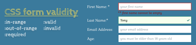
Example for the combination of :in-range, :out-of-range, :valid, :invalid, :required


 ui pencil
Leave a comment