
| CSS property: | |
| Value | width / height |
| Initial value | auto |
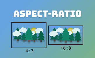
What is the aspect ratio?
The aspect ratio of an element describes the proportion between its width and height, for example: 1/1 (a perfect square) or 16/9 (a typical video aspect ratio). The CSS property aspect-ratio sets the preferred aspect ratio for the targeted element.
1. aspect-ratio: 16/9;
<head>
  <style>
  .sample1{
    aspect-ratio: 16/9;
    width: auto;
    height: 100%;
    background: black;
  }
  </style>
</head>
<body>
  <section style="height: 150px;">
     <img  class="sample1" src="https://uipencil.com/wp-content/uploads/2023/02/uipencil_sample.png" />
  </section>
</body>

2. aspect-ratio: 0.5;
<head>
  <style>
  .sample1{
    aspect-ratio: 0.5;
    width: auto;
    height: 100%;
    background: black;
  }
  </style>
</head>
<body>
  <section style="height: 150px;">
     <img class="sample1" src="https://uipencil.com/wp-content/uploads/2023/02/uipencil_sample.png" />
  </section>
</body>
 Note:
Note:
The preferred aspect ratio for the box is determined by dividing the width by the height, as specified. If the height is not specified, it will default to 1.
In example 2 above, aspect-ratio: 0.5 is equal to aspect-ratio: 0.5/1
object-fit
In the previous examples, when the aspect ratio of an image changes, it can become stretched or squished to fit its container.
By using the CSS object-fit property, it allows you to control how the element is resized/cropped to maintain its proportion within the container.
| CSS property: | |
| Value | fill | contain | cover | none | scale-down |
| Initial value | fill |
1. object-fit
object-fitIt increases or decreases the size of the image and makes sure that the whole image is visible at all times within the container
<head>
  <style>
  .sample1{
    aspect-ratio: 1/1;
    object-fit: contain;
    width: auto;
    height: 100%;
    background: black;
  }
  </style>
</head>
<body>
  <section style="height: 150px;">
     <img class="sample1" src="https://uipencil.com/wp-content/uploads/2023/02/uipencil_sample.png" />
  </section>
</body>
2. object-fit
object-fitThe image will be resized to fill the entire height and width of its container while preserving its aspect ratio, this may result in cropping of the image
<head>
  <style>
  .sample1{
    aspect-ratio: 1/1;
    object-fit: cover;
    width: auto;
    height: 100%;
    background: black;
  }
  </style>
</head>
<body>
  <section style="height: 150px;">
     <img  class="sample1" src="https://uipencil.com/wp-content/uploads/2023/02/uipencil_sample.png" />
  </section>
</body>
3. object-fit
object-fitThis is the default value in CSS which causes the image to be stretched so that it fits the content box, regardless of its aspect ratio.
<head>
  <style>
  .sample1{
    aspect-ratio: 1/1;
    object-fit: fill;
    width: auto;
    height: 100%;
    background: black;
  }
  </style>
</head>
<body>
  <section style="height: 150px;">
     <img class="sample1" src="https://uipencil.com/wp-content/uploads/2023/02/uipencil_sample.png" />
  </section>
</body>
4. object-fit
object-fitThe image will keep its original size and not be influenced by the height and width of the parent container.
<head>
  <style>
  .sample1{
    aspect-ratio: 1/1;
    object-fit: none;
    width: auto;
    height: 100%;
    background: black;
  }
  </style>
</head>
<body>
  <section style="height: 150px;">
     <img  class="sample1" src="https://uipencil.com/wp-content/uploads/2023/02/uipencil_sample.png" />
  </section>
</body>
Browser Compatibility for aspect-ratio
aspect-ratio
| Desktop | Mobile |
|---|---|
 Chrome 88 Edge 88 Safari 15 Firefox 89 Opera 74 Chrome 88 Edge 88 Safari 15 Firefox 89 Opera 74 | Chrome Android 88 WebView Android 88 iOS Safari 15 Firefox Android 92 Opera Android 89 Samsung Internet 15 |
source: https://developer.mozilla.org/en-US/docs/Web/CSS/aspect-ratio#browser_compatibility


 ui pencil
Leave a comment