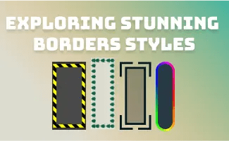
When it comes to web design, small details can make a big impact. Borders are a simple design element that can elevate the look of your website, adding depth and visual interest. With CSS, the possibilities for border styles are virtually endless. In this post, let’s explore some of the most stunning border styles that you can incorporate into your web design.
1. Corner Borders
Result:
HTML & CSS:
<!DOCTYPE html>
<html>
<head>
<style>
.sample{
  position:relative;
  width:100px;
  height:50px;
  line-height: 50px;
  text-align: center;
  background: linear-gradient(to top, rgba(31, 180, 171, 0.38), rgba(219, 207, 102, 0.31));
}
.sample:before,
.sample:after,
.sample>:first-child:before,
.sample>:first-child:after {
    content: ' ';
    position:absolute;
    width:10px;
    height: 10px;
    border-style:solid;
    transition: 1s;
}
/*hover effect*/
.sample:hover:before,
.sample:hover:after,
.sample:hover > :first-child:before,
.sample:hover > :first-child:after {
	width: calc( 120px / 2);
	height: calc( 70px / 2);
}
.sample:before {
  top:-15px;
  left:-15px;
  border-width: 5px 0 0 5px;
  border-color:#D4CC81;
}
.sample:after{
  top:-15px;
  right:-15px;
  border-width: 5px 5px 0 0;
  border-color:#D4CC81;
}
.sample>:first-child:before {
  bottom:-15px;
  right:-15px;
  border-width: 0 5px 5px 0;
  border-color:#1fb4ab;
}
.sample>:first-child:after {
  bottom:-15px;
  left:-15px;
  border-width: 0 0 5px 5px;
  border-color:#1fb4ab;
}
</style>
</head>
<body>
   <div class="sample"><div>Button</div></div>
</body>
</html>
In this example:
- The
.samplediv has a total of 4 pseudo-elements created using the “:before” and “:after” selectors. - There are 2 pseudo-elements created by the “
.sample” div itself to form the top corners, and another 2 are created from its child div to form the bottom corners.
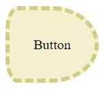
2. Uneven Border Radius
Result:
HTML & CSS:
<!DOCTYPE html>
<html>
<head>
<style>
.sample{
   width: 100px;
   height: 80px;
   line-height: 80px;
   text-align: center;
   border-start-start-radius: 25px 50px;
   border-start-end-radius: 100px 80px;
   border-end-start-radius: 25px 50px;
   border-end-end-radius: 100px 80px;
   background: linear-gradient(to left, #D4CC81, #D61D1D);
   color: black;
   background: rgba(31, 180, 171, 0.38);
   border: #D4CC81 5px dashed;
}
</style>
</head>
<body>
   <div class="sample">Button</div>
</body>
</html>
in this example:
border-start-start-radius: 25px 50px;sets the border radius of the top left corner of the element. The first value (25px) sets the horizontal radius, while the second value (50px) sets the vertical radius. This creates an elliptical curve at the top left corner.border-start-end-radius: 100px 80px;sets the border radius of the top right corner of the element. The first value (100px) sets the horizontal radius, while the second value (80px) sets the vertical radius. This creates a larger elliptical curve at the top right corner.border-end-start-radius: 25px 50px;sets the border radius of the bottom left corner of the element. The first value (25px) sets the horizontal radius, while the second value (50px) sets the vertical radius.border-end-end-radius: 100px 80px;sets the border radius of the bottom right corner of the element. The first value (100px) sets the horizontal radius, while the second value (80px) sets the vertical radius.
3. Rainbow Gradient Border
<!DOCTYPE html>
<html>
<head>
<style>
.sample{
  position: relative;
  text-align: center;
  width: 100px;
  height: 40px;
  line-height: 40px;
  border-radius: 5px;
  z-index: 3;
  color: rgba(0, 0, 0, 0.558);
  font-weight: bold;
}

.sample::before {
  width: 100px;
  height: 40px;
  content: "";
  position: absolute;
  top: 0px;
  left: 0px;
  z-index: -1;
  background: linear-gradient(white, rgba(255, 255, 255, 0.239)) padding-box, linear-gradient(45deg, #FF0000, #FFFF00, #00FF00, #0000FF, #FF00FF) border-box;
  border: 1px solid transparent;
  transition: 1s linear;
  background-position: 0 50%;
  background-size: 300% 300%;
}
.sample:hover{
	cursor: pointer;
}
.sample:hover::before {
    background-position: 100% 50%;
}
.sample::after {
  width: 100px;
  height: 40px;
  content: "";
  position: absolute;
  top: 0px;
  left: 0px;
  z-index: -2;
  filter: blur(10px);
  background: linear-gradient(45deg, #FF0000, #FFFF00, #00FF00, #0000FF, #FF00FF);
}
</style>
</head>
<body>
   <div class="sample">Button</div>
</body>
</html>
Are you interested in discovering more options for creating a stunning gradient border? If so, check out our latest blog post where we dive into a variety of techniques and provide step-by-step instructions on how to achieve them:
4. Stripe Pattern Border
<!DOCTYPE html>
<html>
<head>
<style>

.sample{
  width: 100px;
  height: 50px;
  box-sizing: border-box;
  position: relative;
  overflow: hidden;
  line-height: 50px;
  text-align: center;
}
.sample > div{
   z-index: 1;
   position: absolute;
   width: 90%;
   height: 80%;
   top: 10%;
   left: 5%;
   background: #494949;
   color: yellow;
}
.sample::before {
  content: '';
  position: absolute;
  width: 250%;
  height: 250%;
  background: repeating-linear-gradient(
      yellow 0%,
      yellow 5px,
      black 5px,
      black 10px,
      yellow 10px,
      yellow 15px,
      black 15px,
      black 20px
      );
  transform: translateX(-35%) translateY(-50%) rotate(-45deg);
  z-index: 0;
}
</style>
</head>
<body>
   <div class="sample"><div>Button</div></div>
</body>
</html>
background: repeating-linear-gradient(…) creates a repeating linear gradient background for the pseudo-element. The gradient consists of yellow stripes alternating with black stripes. The effect is achieved by positioning the pseudo-element behind the button using the z-index property, and transforming it to create the diagonal stripe pattern.
5. Rotate the border
<!DOCTYPE html>
<html>
<head>
<style>
.sample{
  position:relative;
  width:100px;
  height:50px;
  line-height: 50px;
  text-align: center;
}
.sample:before,
.sample:after {
  content: ' ';
  position:absolute;
  border-style:solid;
  transition: 1s;
}
.sample:before {
  top:-5px;
  left:-5px;
  border-width: 5px;
  border-color: #5ebd94;
  width: 100%;
  height: 100%;
  transform: rotate(10deg);
  z-index: 2;
}
.sample:after{
  top:-5px;
  right:-5px;
  border-width: 5px;
  border-color: #D4CC81;
  width: 100%;
  height: 100%;
  transform: rotate(-10deg);
  z-index: 1;
}
/*hover effect*/
.sample:hover{
  cursor: pointer;
  background-size: 150% 0%;
}
.sample:hover:before{
  top:-5px;
  right:-5px;
  transform: rotate(-10deg);
}
.sample:hover:after{
  top:-5px;
  left:-5px;
  transform: rotate(10deg);
}
</style>
</head>
<body>
   <div class="sample">Button</div>
</body>
</html>
6. Image border
<!DOCTYPE html>
<html>
<head>
<style>
.sample{
   background: #dddcd0;
   color: black;
   text-align: center;
   width: 150px;
   border: 10px solid transparent;
   border-image: url(repeat_img.png);
   border-image-repeat: repeat;
   border-image-slice: 60;
}
</style>
</head>
<body>
   <div class="sample">Button</div>
</body>
</html>
7. Corner + Double Layer border
<!DOCTYPE html>
<html>
<head>
<style>
.sample{
  position:relative;
  width:100px;
  text-align: center;
  background: rgba(219, 207, 102, 0.31);
   border:5px solid #D4CC81;
   outline: 5px solid #D4CC81;
   outline-offset: 2.5px;
}

.sample:before,
.sample:after,
.sample>:first-child:before,
.sample>:first-child:after {
    content: ' ';
    position:absolute;
    width:20px;
    height: 20px;
    border-style:solid;
    transition: 1s;
}
.sample:before {
  top:-10px;
  left:-10px;
  border-width: 0 5px 5px 0;
  border-color:#D4CC81;
}
.sample:after{
  top:-10px;
  right:-10px;
  border-width:  0 0 5px 5px;
  border-color:#D4CC81;
}
.sample>:first-child:before {
  bottom:-10px;
  right:-10px;
  border-width: 5px 0 0 5px;
  border-color:#D4CC81;
}
.sample>:first-child:after {
  bottom:-10px;
  left:-10px;
  border-width:  5px 5px 0 0;
  border-color:#D4CC81;
}
</style>
</head>
<body>
   <div class="sample">Button</div>
</body>
</html>
In conclusion, borders are a simple yet powerful design element that can take your web design to the next level. By using CSS, you can create stunning border styles that add depth, texture, and visual interest to your website. So go ahead, experiment with these border styles, and let your creativity shine!
If you know of any other great border styles or have experimented with unique variations yourself, please feel free to share your ideas and experiences in the comments section below. Together, we can continue to push the boundaries and inspire others to do the same. Happy Coding 


 ui pencil
Leave a comment