
- 1: Create a Grid Layout, display: grid;
- 2: Define Track Size for Rows and Columns
- 3: Define Track Size for Auto-generated Grid Track
- 4: Define auto-placement direction
- 5: Define Gaps
- 6: Define Grid Area Name and Grid Area Template
- 7: grid-template shorthand
- 8: Positioning & Spanning Grid Items
- 9: Subgrid
- 10: Grid Alignments
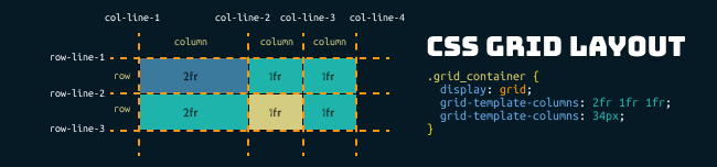
The CSS Grid Layout is a two-dimensional grid-based layout module formed by rows and columns.
The vertical line of grid items are columns.
The horizontal line of grid items are rows.
1: Create a Grid Layout, display: grid;
First of all, let’s start with create a grid container (block-level parent) with multiple grid items (columns and rows), then set the display property of the grid container to display:grid;
CSS:
.grid_container {
  display: grid;
}

.item{
  background: #1fb4ab;
  border:1px solid black;
  text-align: center;
}
HTML:
<div class="grid_container">
  <div class="item">1</div>
  <div class="item">2</div>
  <div class="item">3</div>
  <div class="item">4</div>
  <div class="item">5</div>
  <div class="item">6</div>
</div>
Result:
2: Define Track Size for Rows and Columns
After declaring a grid container, you can proceed to define the number of tracks (rows and columns) you are needed, with their respective track sizes.
grid-template-columns specifies the number of columns and respective column sizes.grid-template- specifies the number of rows and respective column sizes.rows
.grid_container {
  display: grid;
  grid-template-columns: 50px 25% auto;
  grid-template-rows: 60px auto;
}
50px
25%
auto
Define Rows from grid-template-rows
CSS:
.grid_container {
  display: grid;
  grid-template-rows: 18px 25px 30px;
}
Result:
grid-template-rows:18px 25px 30px;
Other Examples:
grid-template-rows: 1fr 1fr
grid-template-rows: repeat(4, 1em);
4 = repeat 4 times,
1em = row height
this is equal to grid-template-columns: 1em 1em1em 1em;
Define Columns from grid-template-columns
CSS:
.grid_container {
  display: grid;
  grid-template-columns: auto auto auto;
}
Result:
grid-template-columns: auto auto auto;
Other Examples:
grid-template-columns: 50px 10% auto;
grid-template-columns: 1fr 1fr2fr 3fr;
grid-template-columns: minmax(55px, 1fr) 1fr 2fr;
The minmax() function defines the minimum and maximum value for the grid box based on available space.
grid-template-columns: repeat(4, 25%);
4 = repeat 4 times,
25% = column width
this is equal to grid-template-columns: 25% 25% 25% 25%;
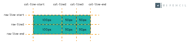
Define Naming for Grid Lines
To define a naming for grid lines, add in a ‘[grid-name]‘ in-front track size
.grid_container {
  display: grid;
  grid-template-columns: [col-line-start] 100px [col-line2] 50px [col-line3] 50px [col-line-end];
  grid-template-columns: [row-line-start] auto [row-line2]  auto [row-line-end];
}
Fr Unit
The fr unit represents the “fraction” of the available space, for example:

3: Define Track Size for Auto-generated Grid Track
The grid-auto-rows & grid-auto-columns properties are to specify the size of any auto-generated grid tracks (which also known as “implicitly-created grid tracks“).
The implicitly-created grid tracks are generated when the items are not explicitly sized by grid-auto-rows/grid-template-columns, or when the grid item is placed out of range and auto-placement algorithm takes place to create additional rows/columns tracks.
grid-auto-rows
.grid_container {
  display: grid;
  grid-template-columns: repeat(3, 50px);
  grid-template-rows: 50px;
  grid-auto-rows: 100px;
}
grid-auto-rows: auto; default
the auto row height will take effect on item 4, item 5 and item 6.
grid-auto-rows: 100px;
the 100px row height will take effect on item 4, item 5 and item 6.
grid-auto-columns
.grid_container {
  display: grid;
  grid-template-columns: repeat(3, 50px);
  grid-auto-columns: 100px;
}
.re_position_item{
  grid-column: 4 / 5; /*the placement is out of the range*/
}
grid-auto-columns: auto; default
the auto column width will take effect on item 1 and item 5.
grid-auto-columns: 100px;
the 100px column width will take effect on item 1 and item 5.
4: Define auto-placement direction
grid-auto-flow specifies how the auto-placement algorithm works and tells the browsers which flow (direction) should follow.
grid-auto-flow
.grid_container {
  display: grid;
  grid-template-columns: repeat(3, auto);
  grid-template-rows: repeat(2, auto);
  grid-auto-flow: row;
}
grid-auto-flow: row; default
grid-auto-flow: column;
5: Define Gaps
The row-gap, column-gap, grid-gap and gap are to specify the gap between the rows and columns.
column-gap
CSS:
.grid_container {
  display: grid;
  column-gap: 50px;
  grid-template-columns: repeat(3, auto);
}
Results:
column-gap: 50px;
row-gap
CSS:
.grid_container {
  display: grid;
  row-gap: 50px;
  grid-template-columns: repeat(3, auto);
}
Results:
row-gap: 50px;
gap
CSS:
.grid_container {
  display: grid;
  gap: 50px;
  grid-template-columns: repeat(3, auto);
}
Results:
gap: 50px;
grid-gap
You can combine the declaration for grid-row-gap and grid-column-gap with grid-gap shorthand.
from:
column-gap: 50px;
row-gap: 2em;
to:
grid-gap: 2em 50px;
6: Define Grid Area Name and Grid Area Template
grid-area & grid-template-areas
The grid-area CSS is to specify a name for grid item so that the item can be referenced by the template from grid-template-areas
The grid-template-areas CSS is to set up a grid template. In CSS, each name is separated by a white space:
HTML:
.grid_container {
  display: grid;
  grid-template-columns: 1fr 2fr 1fr;
  grid-template-rows: repeat(3, minmax(50px,auto));
  grid-template-areas:
        "header header header"
        "sidebar maincontent maincontent"
        "footer footer footer";
}
.item_header{
  grid-area: header;
}
.item_sidebar_left{
  grid-area: sidebar;
}
.item_maincontent{
  grid-area: maincontent;
}
.item_footer{
  grid-area: footer;
}
CSS:
<div class="grid_container">
  <div class="item item_header">header</div>
  <div class="item item_sidebar_left">sidebar</div>
  <div class="item item_maincontent">maincontent</div>
  <div class="item item_footer">footer</div>
</div>
Result:
More examples:
use ” . ” for an empty grid cell
grid-template-areas:
". header header"
"sidebar maincontent ."
"sidebar footer footer";
grid-template-areas:
"header header header"
"sidebar . maincontent"
"sidebar footer footer";
7: grid-template shorthand
You can combine the declaration for grid columns, rows, and areas with grid-template-areas shorthand. For example:
Example 1: Combine grid-template-rows and grid-template-columns
From:
grid-template-columns: 1fr 2fr 1fr;
grid-template-rows: 80px minmax(50px,auto) 40px;
To:
grid-template:80px minmax(50px,auto) 40px / 1fr 2fr 1fr;
Example 2: Combine grid-template-areas grid-template-rows and grid-template-columns
From:
grid-template-columns: 1fr 2fr 1fr;
grid-template-rows: 80px minmax(50px,auto) 40px;
grid-template-areas:"header header header"
                    "sidebar maincontent maincontent"
                    "footer footer footer";
To:
grid-template:"header header header" 80px
              "sidebar maincontent maincontent" minmax(50px,auto)
              "footer footer footer" 40px / 1fr 2fr 1fr;
8: Positioning & Spanning Grid Items
Below are CSS properties to specify how the targeted grid item is positioned or spans across row/column.
| CSS property | Description |
|---|---|
grid-row-start | specifies the start position for the grid item within grid row |
grid-row-end | specifies the end position for the grid item within grid row |
| grid-column-start | specifies the start position for the grid item within grid column |
| grid-column-end | specifies the end position for the grid item within grid column |
grid-row | shorthand for grid-row-start and grid-row-end. |
grid-column | shorthand for grid- and grid-. |
| grid-area | shorthand for grid-row-start, grid-column-start, grid-row-end and grid-column-end. |
What is Grid line?
Grid Lines are referring to the dividing lines that make up the structure of the grid, we can use grid lines to define the position of the grid item.
Positioning Grid Item
HTML & CSS:
.grid_container {
  display: grid;
  grid-template-columns: repeat(3, auto);
}
.selected_item{
  grid-row-start: 3;
  grid-row-end: 4;
  grid-column-start: 2;
  grid-column-end: 3;
  background: red;
}
<div class="grid_container">
  <div class="item selected_item">1</div>
  <div class="item">2</div>
  <div class="item">3</div>
  <div class="item">4</div>
  <div class="item">5</div>
  <div class="item">6</div>
  <div class="item">7</div>
  <div class="item">8</div>
  <div class="item">9</div>
</div>
Result:
grid-row-start: 3;grid-row-end: 4;grid-column-start: 2;grid-column-end: 3;grid-row, grid-column and grid-area
grid-row: 3 / 4;
grid-column: 2 / 3;
grid-row is shorthand for grid-row-start and grid-row-end.grid-column is shorthand for grid-column-start and grid-column-end.
grid-area: 3 / 4 / 2 / 3
grid-area is shorthand for grid-row-start, grid-column-start, grid-row-end and grid-column-end.
Note: If the grid line has assigned a name, the item also can be positioned by line names. for eg: grid-row: row-name-1 / row-name-2;
grid-row-start: row-name-1;
grid-row-end: row-name-2;
Spanning Across Rows / Columns
Example 1: Specify from line number
HTML & CSS:
.grid_container {
  display: grid;
  grid-template-columns: repeat(3, auto);
}
.selected_item{
  grid-row-start: 3;
  grid-row-end: 4;
  grid-column-start: 2;
  grid-column-end: 4;
  background: red;
}
<div class="grid_container">
  <div class="item selected_item">1</div>
  <div class="item">2</div>
  <div class="item">3</div>
  <div class="item">4</div>
  <div class="item">5</div>
  <div class="item">6</div>
  <div class="item">7</div>
  <div class="item">8</div>
  <div class="item">9</div>
</div>
Result:
grid-row-start: 3;grid-row-end: 4;grid-column-start: 2;grid-column-end: 4;grid-row, grid-column and grid-area
grid-row: 3 / 4;
grid-column: 2 / 4;
grid-row is shorthand for grid-row-start and grid-row-end.grid-column is shorthand for grid-column-start and grid-column-end.
grid-area: 3 / 4 / 2 / 4
grid-area is shorthand for grid-row-start, grid-column-start, grid-row-end and grid-column-end.
Example 2: Use grid-row:span [X]; / grid-column: span [X];
CSS:
.grid_container {
  display: grid;
  grid-template-columns: repeat(3, auto);
}
.selected_item{
  grid-row: 3 / span 2;
  grid-column: span 3;
  background: red;
}
Results:
grid-row: 3 / span 2;grid-column: span 3;
9: Subgrid
10: Grid Alignments
To learn more about grid alignments, please follow the link provided below for further reading. In the next article, you will be taken through a detailed explanation and exploration of the below subjects:
- Alignment of the overall grid items along the row/column axis
- 1: Row :
justify-items - 2: Column :
align-items - 3: Shorthand :
place-items
- 1: Row :
- Alignment of the grid container along the row/column axis
- 1: Row :
justify-content - 2: Column :
align-content - 3: Shorthand :
place-content
- 1: Row :
- Alignment of the individual grid item along the row/column axis
- 1: Row :
justify-self - 2: Column :
align-self - 3: Shorthand :
place-self
- 1: Row :


 ui pencil
Leave a comment