
When creating the CSS Grid Layout Module, you can use display:grid; to create a grid container, and also create nested grids by making the grid item itself a grid container. for example:
HTML & CSS :
<style>
.grid_container{
   display:grid;
   grid-template-columns: 1fr 1fr;
   gap: 10px;
}
.grid_item{
   display: grid;
   border: 1px solid black;
}
.title{
    background: rgba(255,0,0,0.3);
    border-bottom: 3px dashed red;
}
</style>

<div class="grid_container">
   <div class="grid_item">
	  <div class="title">title<br>title line2<br>title line3
      </div>
      <div class="despt">Lorem ipsum dolor sit amet, consectetur adipiscing elit. In nibh magna
      </div>
   </div>
   <div class="grid_item">
	  <div class="title">title
      </div>
      <div class="despt">Lorem ipsum dolor sit amet, consectetur adipiscing elit. In nibh magna
      </div>
   </div>
</div>
However, the nested grid items are independent across the parent grid and of each other, hence, the tracks size across different nested grid containers does not affect each other:
title line2
title line3
By default, the “red highlighted area” (.grid_item) will not be aligned between each other.
Introducing subgrid
The CSS Grid Layout Module Level 2 specification has expanded CSS Grid Module with the subgrid feature, by introducing a new value “subgrid” in grid-template-columns & grid-template-rows, instead of creating a new track, the nested grid item inherited the tracks definition from the parent container.
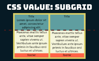
In this example, to align the “red highlighted area” across different nested grid items, we can use grid-template-rows: subgrid; in .grid_item. Since the nested grid spans 3-row tracks of the parent, from row line 1 to row line 3, specify grid-row: 1 / 3; as well. (click here to understand more about grid-row)
HTML & CSS:
<style>
.grid_container{
   display:grid;
   grid-template-columns: 1fr 1fr;
   gap: 10px;
}
.grid_item{
   display: grid;
   border: 1px solid black;

   grid-row: 1 / 3;
   grid-template-rows: subgrid;
}
.title{
    background: rgba(255,0,0,0.3);
    border-bottom: 3px dashed red;
}
</style>

<div class="grid_container">
   <div class="grid_item">
	  <div class="title">title<br>title line2<br>title line3
      </div>
      <div class="despt">Lorem ipsum dolor sit amet, consectetur adipiscing elit. In nibh magna
      </div>
   </div>
   <div class="grid_item">
	  <div class="title">title
      </div>
      <div class="despt">Lorem ipsum dolor sit amet, consectetur adipiscing elit. In nibh magna
      </div>
   </div>
</div>
Result:
title line2
title line3
Browser compatibility
| Desktop | Mobile |
|---|---|
 Chrome Edge Chrome Edge  Safari 16 Firefox 71 Opera 79 Internet Explorer Safari 16 Firefox 71 Opera 79 Internet Explorer | Chrome Android WebView Android iOS Safari 16 Firefox Android Opera Android Samsung Internet |
Source:  https://developer.mozilla.org/en-US/docs/Web/CSS/CSS_Grid_Layout/Subgrid#browser_compatibility


 ui pencil
Leave a comment