What is CSS accent-color
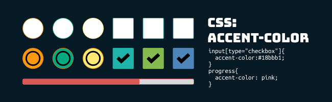
The CSS accent-color is a quick solution to specify theme color in a default form control like: <checkboxes>, <input type ="radio"> , <input type = "range"> and <progress>
The CSS accent-color is supported in most modern browsers. If the browser is unsupported, it will be displayed in default color.
| CSS property: | accent-color |
| Value: | auto | initial | inherit | color |
| Initial value: | auto |
Examples
HTML:
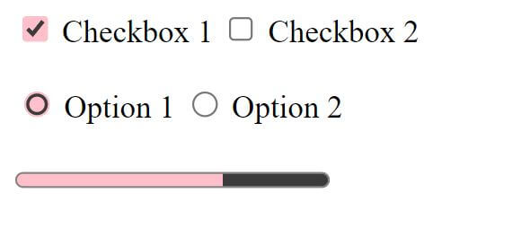
<form class="form1">
  <input type="checkbox" name="checkbox1" checked />
  <lable for="checkbox1">Checkbox 1</lable>
  <input type="checkbox" name="checkbox2" />
  <lable for="checkbox1">Checkbox 2</lable>
  <br>
  <br>
  <input type="radio" value="radio1" checked />
  <label for="radio1">Option 1</label>
  <input type="radio" value="radio2" />
  <label for="radio2">Option 2</label>
</form>
<br>
<form class="form2">
  <progress value="66" max="100"> 66% </progress>
</form>
CSS
1. for an individual form element
input[type="checkbox"]{
  accent-color:#18bbb1;
}
input[type="radio"] {
  accent-color:rgba(255,165,0,0.8)
}
progress{
  accent-color: pink;
}
2. for individual form
.form1{
  accent-color: pink;
}
.form2{
  accent-color: orange;
}

3. for the whole document
:root {
  accent-color: pink;
}
Browser compatibility
| Desktop | Mobile |
|---|---|
 Chrome 93 Edge 93 Safari 15.4 Firefox 92 Opera 79 Chrome 93 Edge 93 Safari 15.4 Firefox 92 Opera 79 Internet Explorer Internet Explorer | Chrome Android 93 WebView Android 93 iOS Safari 15.4 Firefox Android 92 Opera Android 66 Samsung Internet 17.0 |
source: https://developer.mozilla.org/en-US/docs/Web/CSS/accent-color#browser_compatibility


 ui pencil
Leave a comment