

- HTML – <progress>
- Indeterminate vs. Determinate
- CSS styling for HTML <progress>
- Browser compatibility
HTML – <progress>
The HTML <progress> tag illustrates a bar to represent the current percentage of an ongoing work. Generally, the progress bar is formed by 2 attributes, which are: value (the amount of work completed) and max (the amount of work in total).
Based on the figure from value and max, the browser will automatically calculate the percentage and adjust the length of the value bar, and then display it accordingly.
| HTML element | <progress> |
In this example:
– Amount of work in total: 100
– Amount of work completed: 59
<progress value="59" max="100"> </progress>

| Attribute | Description | Value type | Default value | Mandatory |
|---|---|---|---|---|
value | Value of work completed (the value must fall between 0 and max. If then the range of | number | – | no |
| Value of work in total (the value must be greater than 0) | number | 1 | no |
 During the resize, the progress value bar will automatically scale to fit its ratio.
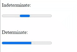
Indeterminate vs. Determinate
Generally, we have 2 types of progress bars:
- Indeterminate – if the progress bar has NOT included any value attribute
- Determinate – if the progress bar has included a value attribute
<form>
    <p>Indeterminate:</p>
    <progress max="100"> </progress>
    <br>
    <br>
    <p>Determinate:</p>
    <progress value="59" max="100"> </progress>
</form>
How to Style HTML <progress> from CSS
The appearance of the HTML progress bar differs from browser to browser. To define the desired appearance for your HTML progress bar, first of all, you need to reset the progress bar to its default appearance.
HTML:
<style>
/*style for overall progress bar */
progress{
    /*reset to default appearance*/
    -webkit-appearance: none;
    -moz-appearance: none;
    appearance: none;

    width: 200px;
    height: 20px;
    border-radius: 20px;
    border: 1px solid #434343;
}

/*style for background track*/
progress::-webkit-progress-bar {
    background: rgb(221, 221, 221);
    box-shadow: 0 2px 3px rgba(0, 0, 0, 0.2) inset;
    border-radius: 20px;
}
/*style for progress track*/
progress::-webkit-progress-value {
    background-image: linear-gradient(120deg,#ffd173 0,#18cc00 55%);
    border-radius: 20px;
}
</style>

<form>
    <progress value="59" max="100"> </progress>
</form>
Result:

For a quick solution to style the overall theme color, you can also choose to use CSS accent-color. To understand more about the usage of CSS accent-color: https://uipencil.com/2022/08/20/css-accent-color/
Browser compatibility
| Desktop | Mobile |
|---|---|
 Chrome 6 Edge 12 Safari 6 Firefox 6 Opera 11 Chrome 6 Edge 12 Safari 6 Firefox 6 Opera 11 | Chrome Android WebView Android iOS Safari 7 Firefox Android 6 Opera Android 11 Samsung Internet |
source: https://developer.mozilla.org/en-US/docs/Web/HTML/Element/progress#browser_compatibility
Last but not least
One important note is that people should not mix up the usage of <meter> and <progress>. By just looking at the appearances, they may seem identical (with just a bar with a track). But one should note that <progress> should only be used to display progress, while <meter> should mainly be used to display gauge. To know more details about <meter>, you may refer to the post below.


 ui pencil
Leave a comment