
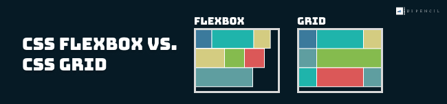
CSS Grid Layout and CSS Flexbox Layout have distinct differences in their design and functionality. Flexbox is designed to handle layout in one dimension, either a row or a column, while Grid is designed to handle two-dimensional layout, which including both rows and columns.
While both layouts share some similarities, it’s essential to recognize that there are differences between them for various display purposes. In this article, we’ll understand more about the differences between Flexbox and Grid Layout, and guide you on the best times to use each layout.
1-Dimensional vs. 2-Dimensional
CSS Flexbox
The CSS Flexbox Layout is a one-dimensional flexible box layout that works on either rows or columns at a time. The CSS property flex-direction define the main axis and direction of the display.
row
column
row-reverse
column-reverse
CSS Grid Layout
The CSS Grid Layout is a two-dimensional grid-based layout module formed by rows and columns.
- The vertical line of grid items are columns.
- The horizontal line of grid items are rows.
Flexbox is ideal for creating layouts that arrange and distribute elements in a single row or column. For eg: navigation bar
The CSS Grid Layout is ideal for creating two-dimensional layouts that utilize both rows and columns. For eg: table
Content First vs. Layout First
CSS Flexbox – Content First
With Flexbox, the layout of your content is determined by the content itself, making it ideal for situations where the size of your elements is dynamic / not known beforehand.
CSS Grid – Layout First
On the other hand, CSS Grid is best suited for layouts where the content is determined by the layout, as the two-dimensional grid system allows you to arrange elements using rows and columns.
Simple vs. Complex Layout
CSS Flexbox
Flexbox is a great layout system to use when designing web pages and dealing with unknown or dynamic content.
With CSS Flexbox, you can control the direction of the flow of elements, the distribution of space between elements, and the alignment of elements within a container.
It is best suited for creating simple and flexible layouts that are easy to maintain and respond to changes in the size of the viewport.
CSS Grid
The Grid layout is ideal for creating complex and flexible grid-based layouts, such as multi-column and multi-row layouts
Additionally, CSS Grid also provides a powerful set of layout tools, such as the “grid-template-columns” and “grid-template-rows” properties, that allow you to specify the size and position of columns and rows in your grid. With these tools, you can create complex and responsive layouts that can adapt to different screen sizes and aspect ratios.
Only in CSS Grid : Define Grid Area Name and Grid Area Template
With CSS Grid, you can use the grid-template-areas property to define the structure of your grid by creating named grid areas.
Each named grid area can then be assigned to a specific element on your page, making it easy to see how the different parts of your layout fit together.
This not only improves the readability of your code, but it also makes it easier to make changes to your layout, as you can simply adjust the names of the grid areas instead of having to manually update the positions of individual elements. Complete Tutorial for How to Define Grid Area Name and Grid Area Template
for example:
.grid_container {
  display: grid;
  grid-template-columns: 1fr 2fr 1fr;
  grid-template-rows: repeat(3, minmax(50px,auto));
  grid-template-areas:
        "header header header"
        "sidebar maincontent maincontent"
        "footer footer footer";
}
.item_header{
  grid-area: header;
}
.item_sidebar_left{
  grid-area: sidebar;
}
.item_maincontent{
  grid-area: maincontent;
}
.item_footer{
  grid-area: footer;
}
Only in CSS Grid : Positioning & Spanning Items
Additionally, CSS Grid offers greater control over positioning grid elements through the use of grid-area CSS property. This allows developers to precisely specify how a grid item should be positioned or span across rows and columns, providing an extra level of customization that is limited in Flexbox. Complete Tutorial for Positioning & Spanning Grid Items
Conclusion
In conclusion, there is no clear-cut definition of when to use a flexbox or when to use a grid layout. In many cases, both layouts can actually achieve the same result, but with different levels of efficiency.
CSS Grid is better for creating grid-based layouts, while CSS Flexbox is better for creating flexible one-dimensional layouts. The best solution to decide which to use is to have a thorough understanding of both layouts and combine them to choose the most suitable one for each specific need.


 ui pencil
Leave a comment